With vigorously growing smart-phone Internet usage data (please see table below) it has become wildly important to create mobile ready website versions. Emphasising this further, in April 2015 Google changed its search algorithm to give greater weight to websites that are mobile-friendly; revealing that more searches take place on smartphones and tablets than on desktops. “Consumers, particularly on mobile devices, now have higher expectations than ever before – they want everything right, and they want everything right away. This requires that marketers answer their needs in the moment, whenever and wherever they are,” says Google.
Mobile Internet Usage 2010 – 2014
Source: https://en.wikipedia.org/wiki/Usage_share_of_web_browsers http://www.sitepoint.com/
2010: Mobile usage 2.86% of all web activity
2011: Mobile usage 7.02% of all web activity
2012: Mobile usage 14.55% of all web activity
2013: Mobile usage 23.41% of all web activity
2014: Mobile usage 33.66% of all web activity
Putting this data in to perspective, here is a glance at digital Internet usage growth overall:
Total Digital Media Time Spent by Platform
Source: comScore Media Metrix Multi-Platform & Mobile Metrix, U.S,. Dec 2014 / Dec 2010
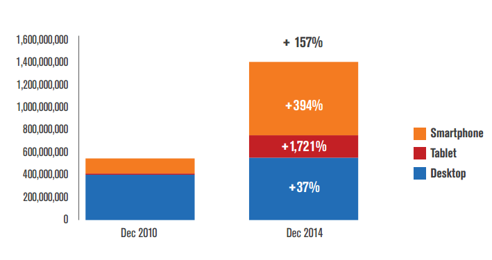
Most of the growth in digital media consumption over the past four years has occurred on smartphones (up 394%) and tablets (up 1,721%), these mobile platforms are not eating into aggregate time spent on desktop, which has still grown 37% over this time period. Meaning more people use digital platforms more frequently, over a larger number of devices.
And so it goes that the answer to the question of ‘how’ (how do I get my website on to mobile devices?) has largely been to create websites using responsive design. Responsive Web Design (RWD) is an approach to web design aimed at crafting sites to provide an optimal viewing and interaction experience—easy reading and navigation with a minimum of resizing, panning, and scrolling—across a wide range of devices (from desktop computer monitors to mobile phones). And although ‘flexible’, ‘liquid’, ‘fluid’ was used to describe layouts by 2008, it was 2010 before Ethan Marcotte* coined the term responsive web design (RWD), and by 2012 Responsive design was listed as #2 in Top Web Design Trends. RWD provides a viable mobile solution that is maintenance free – a solution that over time is low-resource and low-cost. A ‘One-Size-Fits-All’ website.*(http://abookapart.com/products/responsive-web-design)
But in todays world where digital users are multi device orientated, is a One-Size-Fits-All website good enough?
Look at this:
Internet & Device statistics 2014:
- 42% of the world’s population by December 2014 were using the Internet
- 89% of the U.S population by December 2014 were using the Internet
- 10% of the world’s population in 2014 had a fixed broadband subscription
- 28% of the U.S population in 2014 had a fixed broadband subscription
- 20% of the worldwide population owned a smartphone by 2014 (around 1.75 billion people)
- 4% of the U.S population owned a smartphone by 2014 (around 163.9 million people)
- 10 % of the worldwide population owned a tablet by 2014 (around 909.7 million people)
- 46% of the U.S population owned a tablet by 2014 (around 147.7 million people)
Source: http://www.pewinternet.org/2015/04/01/us-smartphone-use-in-2015/ http://www.internetworldstats.com/stats.htm http://www.emarketer.com/Article/Smartphone-Users-Worldwide-Will-Total-175-Billion-2014/1010536 http://www.emarketer.com/Article/Tablet-Users-Surpass-1-Billion-Worldwide-2015/1011806 https://en.wikipedia.org/wiki/List_of_countries_by_number_of_broadband_Internet_subscriptions
And:
Share of Content Category Time Spent by Platform:
Source: comScore Media Metrix Multi-Platform, U.S., Dec 2014
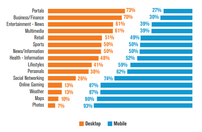
We can see from this report that categories such as Photos and Maps are more often than not used on the go, lending themselves to heavy mobile usage, while the Portals and Business/Finance categories comparatively index much higher on desktop devices.
But what does this mean? It shows that people have a tendency to use different devices for different activities. Strongly supporting an argument that responsive designs are no longer good enough because a responsive design is one website, usually catering first to desktop, with technology that enables it to shrink and stretch to different screen resolutions, that has exactly the same content across every device. Prompting a hugely important question as to whether companies are losing sales because their website does not present the ever-fickle consumer optimised content for their individual devices.
In conclusion:
Whilst responsive designs may have their place in the world still, it is important for businesses to employ a Device Strategy that explores a number of industry and content factors before making a decision as to what type of mobile/tablet website it needs. For example, above statistics suggest that a higher number of people have smartphones, data further suggests that 7% of the U.S., population are smart phone dependent with no other means to access the internet – lower income people and families, so if I am an apparel retail online store that sells low-cost high-street items, I might want to consider focussing more on the smart-phone version of my website. Equally, if I am a retailer who targets all levels of income, I might want to optimise my desktop website towards high-end gear and my smart-phone version towards lower-end gear. Or I might be a website of generic industry/goods/services that already focuses on multi media platform content optimisation where a device strategy can provide a key opportunity to explore which device should be optimised more for which content. Since a responsive web design is restricted to its original website content, these innovations would be impossible to achieve using a responsive design. Meaning it is quite possible that a number of company’s are missing out on valuable sales by restricting opportunities for design by device innovation.